How useful is your business dashboard?
Dashboards, they’re all the rage aren’t they? It is very common that you find management teams talking about dashboards.
But, just how useful are most dashboards, really?
This article challenges what some of the dashboards available to management teams produce and some of the features that a good dashboard offers.
Visual management
The first point, definitely in our minds, is the quality of the visual management information that a dashboard can produce.
If you are unfamiliar with the term ‘visual management’ don’t worry. If you have seen a set of traffic lights, and understand what each colour light means, then you’ll understand the intention and purpose of visual management.
Good visual management allows you to immediately understand the position of a topic by just looking at it. The traffic light colours find their way into many different reporting approaches, commonly known as RAG reporting (as in Red, Amber and Green). Red is bad, green is good and amber is ‘drifting’ towards either end.
The same can be said for trend lines on graphs and smiley faces that accompany a score sheet.
If you can immediately understand the status of something just by looking at it then you are probably experiencing good visual management. Visual usually implies visible too. Hiding away good information isn’t part of visual management!
If you think of the dashboard of your car then you’ll have a pretty good idea of the basic requirements for a good dashboard; key data only, visual where possible (gauges, flashing lights etc…).
Does your dashboard have good visual management?
What’s on your dashboard?
The next point is that you can’t have everything on your dashboard.
If you think about the dashboard you have in your car you will see this point exactly. The car’s computer doesn’t give you every single detail, it gives you enough information to make decisions.
Most cars have speed, engine revs, fuel level, engine temperature (if the car has an engine, of course!) and some kind of trip counter. Warning lights are also present (see the RAG point above). The dashboard presents to you enough information to determine what the correct course of action is.
You might need to adjust your speed, fuel up, change course or pull over and call in help (especially when all those lights start blinking!).
What do you have on your dashboard? Do you have too much or too little on your dashboard? It is not uncommon to see too much information being crammed into one place. Although it can be tempting, a good dashboard is very much a case of ‘less is more’.
Can it link to key information?
If you see something on your dashboard that needs to be addressed, what can you do about it?
Knowing what needs to be looked at is one thing, being able to instantly see what the information is made up of is another.
We have seen beautifully produced dashboards presented to owners and managing directors, only to end there.
They can’t drill down to the data behind the information and decide what the business needs to do next.
Does your dashboard allow you to drill down, when required?
Static versus dynamic
The last point in our list is how the information is pulled together for your dashboard.
Can you access a current state of play with your business data, or is it a snapshot in time?
Many businesses have a snapshot. If you can’t access dynamic information then this is certainly better than nothing, depending on how old the snapshot it.
These static snapshots can also be labour intensive to produce, this is worth bearing in mind.
So, an ideal situation is to have a dashboard that:
- Incorporates simple visual management techniques (e.g. RAG colouring).
- Covers key information and doesn’t overwhelm the user.
- Allows drill down into the data and enables fast, accurate, business decision making.
- Is real time*.
(* Could you imagine if you car dashboard was only a snapshot in time?)
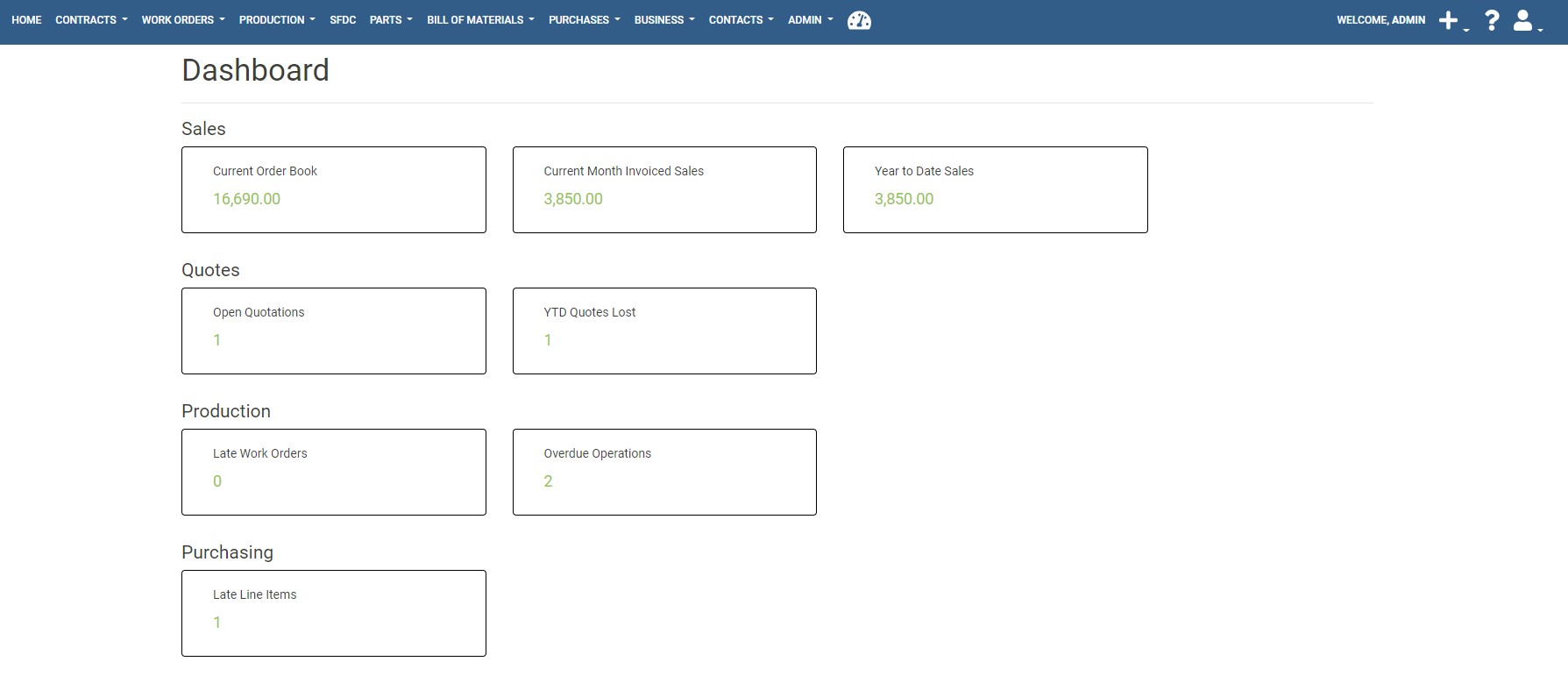
The Fraction ERP dashboard
When we were designing the Fraction ERP dashboard we did our best to incorporate these principles.
We have limited the number of aspects the dashboard covers, allows a drill down into the data and is real time.
You can see a screenshot of our dashboard below:
If you want to see how this dashboard works then get in touch for a no obligation demo.
You can also catch the dashboard briefly in our overview demo at 3:10 - the video below starts at the right point:
To sign up for a demo, just complete the form below.
Otherwise, we hope that you have some ideas for your own dashboard to help with improved decision making. After all, that’s what a good ERP system should help you to do!